When working with Jupyter Notebook, displaying your plots directly in the notebook is highly valuable. Matplotlib offers different “modes” through magic commands like %matplotlib inline, which renders static images, and interactive modes like %matplotlib notebook or %matplotlib widget that allow you to zoom, pan, and update your visualizations dynamically. This tutorial explains both approaches in detail, with code examples and breakdowns of each step.
1. Enabling Inline Plotting
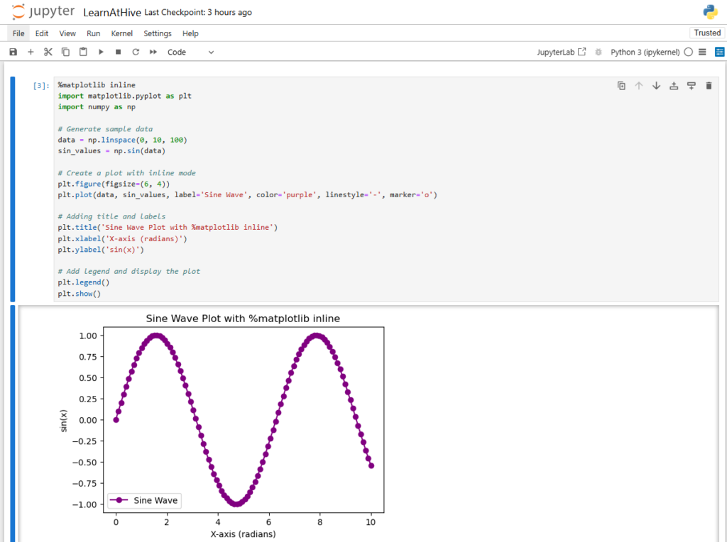
The %matplotlib inline magic command tells Jupyter Notebook to render Matplotlib plots as static images directly within the notebook cells. This is the simplest and most commonly used mode when sharing or presenting results.
Code Example:
%matplotlib inline
import matplotlib.pyplot as plt
import numpy as np

# Generate sample data
data = np.linspace(0, 10, 100)
sin_values = np.sin(data)

# Create a plot with inline mode
plt.figure(figsize=(6, 4))
plt.plot(data, sin_values, label='Sine Wave', color='purple', linestyle='-', marker='o')

# Adding title and labels
plt.title('Sine Wave Plot with %matplotlib inline')
plt.xlabel('X-axis (radians)')
plt.ylabel('sin(x)')

# Add legend and display the plot
plt.legend()
plt.show()
Output:

Code Breakdown
%matplotlib inline
This magic command configures Jupyter Notebook to display the plot output right below the code cell.
- plt.figure(figsize=(8, 6)): Creates a figure with a specified size of 8 inches by 6 inches.
- plt.plot(…): Plots the sine values using a solid purple line with circular markers.
- plt.title(), plt.xlabel(), plt.ylabel(): Add a descriptive title and labels to the x- and y-axes.
- plt.legend(): Displays the legend based on the provided label.
- plt.show(): Renders the plot within the notebook cell.
2. Enabling Interactive Plotting
For enhanced interactivity—such as zooming, panning, and real-time updates—you can switch to an interactive backend. Two popular approaches include:
- %matplotlib notebook: Provides interactivity using the classic notebook backend with interactive widgets (does not work with some versions).
- %matplotlib widget: Offers a modern interactive backend by using Jupyter’s ipympl extension (make sure to install it with
pip install ipympl, if you have further problems try upgrading with pip install --upgrade ipywidgets ipympl).
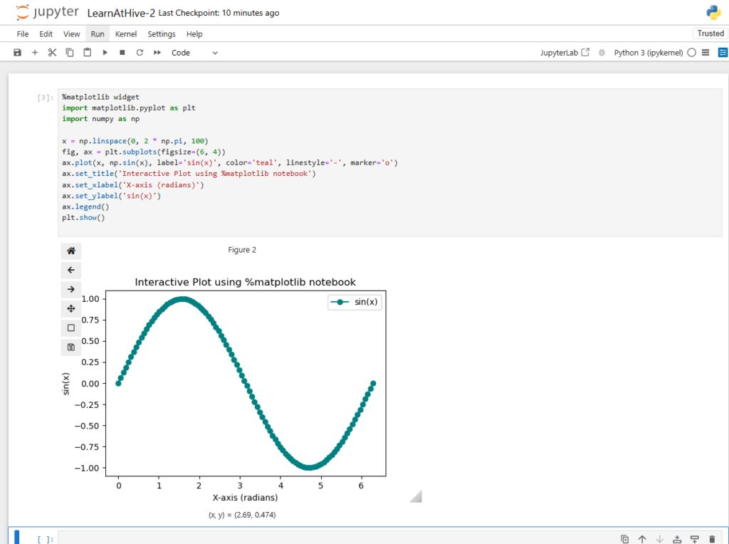
Below is an example using %matplotlib widget.
%matplotlib notebook
import matplotlib.pyplot as plt
import numpy as np

# Generate sample data for a complete period of a sine wave
x = np.linspace(0, 2 * np.pi, 100)

# Create a Figure and an Axes
fig, ax = plt.subplots(figsize=(8, 6))

# Plot the sine function with interactive markers
ax.plot(x, np.sin(x), label='sin(x)', color='teal', linestyle='-', marker='o')

# Set descriptive titles and labels
ax.set_title('Interactive Plot using %matplotlib notebook')
ax.set_xlabel('X-axis (radians)')
ax.set_ylabel('sin(x)')

# Add a legend for clarity
ax.legend()

# Display the interactive plot
plt.show()
Output:

Code Breakdown
- %matplotlib notebook: Activates an interactive backend that embeds interactive plots with support for zooming and panning.
- fig, ax = plt.subplots(…): Creates the Figure and Axes objects; the interactive mode lets you manipulate these objects more dynamically.
- ax.plot(…): Similar to the inline example, this plots the data but now within an interactive widget.
- ax.set_title(), ax.set_xlabel(), ax.set_ylabel(): Add context with labels and titles.
- ax.legend(): Helps viewers distinguish the plotted line with an accompanying label.
- plt.show(): Renders the interactive plot in the notebook cell.
Summary
In this tutorial, you learned how to leverage Jupyter Notebook magic commands to control how Matplotlib renders plots:
- %matplotlib inline: Displays plots as static images directly under the code cell.
- %matplotlib notebook / %matplotlib widget: Enables interactive plotting, allowing for zooming, panning, and a dynamic user experience.
- Each method uses the same set of Matplotlib commands to build the plots; the difference lies in how the backend renders the output.
By understanding these modes, you can choose the appropriate plotting configuration for your workflow—whether you need a simple static image for reports or interactive figures for data exploration.
