Scatter plots are essential for visualizing the relationship between two numerical variables. In this tutorial, we will first create a basic scatter plot using random data and then demonstrate how to enhance the visualization by encoding additional dimensions with marker size, color, and transparency (alpha). This approach helps uncover patterns and insights in your dataset.
1. Basic Scatter Plot
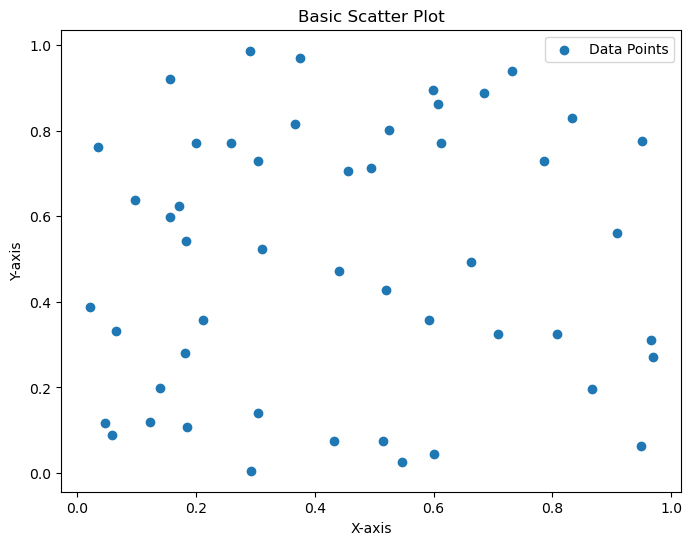
The following code example generates 50 random data points for the x and y axes and plots them using Matplotlib’s scatter function. A title, axis labels, and a legend are added for clarity.
import matplotlib.pyplot as plt
import numpy as np

# Generate sample data: 50 random values for both x and y axes
np.random.seed(42) # For reproducibility
x = np.random.rand(50)
y = np.random.rand(50)

# Create a figure with a specified size
plt.figure(figsize=(8, 6))

# Create a basic scatter plot
plt.scatter(x, y, label='Data Points')

# Add title and axis labels
plt.title('Basic Scatter Plot')
plt.xlabel('X-axis')
plt.ylabel('Y-axis')

# Add a legend to identify the data
plt.legend()

# Display the plot
plt.show()
Output:

This Python code uses the matplotlib.pyplot and numpy libraries to create a simple scatter plot. It starts by importing these libraries, then generates 50 random data points for both the x and y axes using np.random.rand(), with a fixed seed (42) for reproducibility. A figure is created with a size of 8×6 inches using plt.figure(). The plt.scatter() function plots the x and y values as individual points, labeled as “Data Points.” The code then adds a title (“Basic Scatter Plot”) and labels for the x-axis (“X-axis”) and y-axis (“Y-axis”) using plt.title(), plt.xlabel(), and plt.ylabel(). A legend is included with plt.legend() to identify the data points, and finally, plt.show() displays the completed plot. This results in a straightforward visualization of random data points scattered across a 2D plane.
2. Scatter Plot with Custom Size, Color, and Transparency
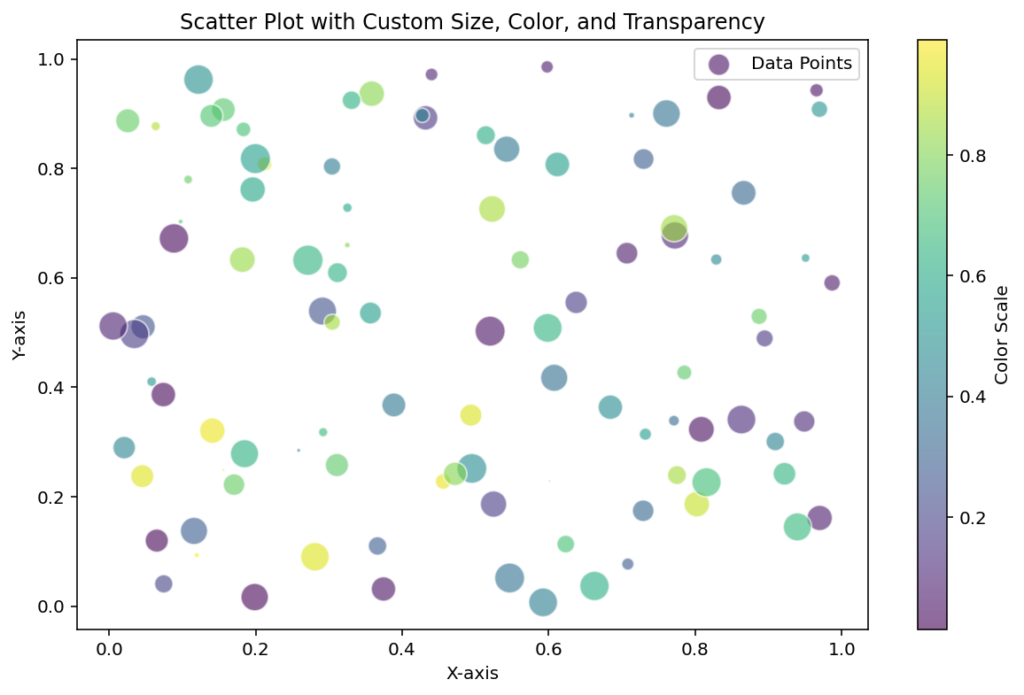
This enhanced scatter plot example demonstrates how to vary marker sizes and colors based on additional data attributes while setting transparency. We also include a colorbar to visualize the color mapping.
import matplotlib.pyplot as plt
import numpy as np

# Generate sample data: 100 data points with additional variables for marker size and color
np.random.seed(42)
x = np.random.rand(100)
y = np.random.rand(100)

# Create an array for sizes (scaled for visibility) and a color variable
sizes = np.random.rand(100) * 300 # Scale sizes
colors = np.random.rand(100) # Random values for color mapping

# Create a figure with a specified size
plt.figure(figsize=(10, 6))

# Create an enhanced scatter plot with custom size, color (with colormap), and transparency
scatter = plt.scatter(x, y, s=sizes, c=colors, cmap='viridis', alpha=0.6, edgecolors='w', label='Data Points')

# Add title and axis labels
plt.title('Scatter Plot with Custom Size, Color, and Transparency')
plt.xlabel('X-axis')
plt.ylabel('Y-axis')

# Add a colorbar to illustrate the color mapping
cbar = plt.colorbar(scatter)
cbar.set_label('Color Scale')

# Add a legend to identify the data
plt.legend()

# Display the plot
plt.show()
Output:

This Python code builds a more advanced scatter plot using matplotlib.pyplot and numpy, enhancing the basic version with custom features. It begins by importing the required libraries and generating 100 random data points for the x and y axes with np.random.rand(), using a seed (42) for consistency. Two additional arrays are created: sizes, which scales 100 random values by 300 to control the marker sizes, and colors, which assigns random values to map colors to each point. A figure is set up with a 10×6-inch size using plt.figure(). The plt.scatter() function then creates the scatter plot, incorporating s=sizes for varying point sizes, c=colors for color variation (mapped to the ‘viridis’ colormap), alpha=0.6 for 60% transparency, and edgecolors=’w’ for white outlines around points, labeled as “Data Points.” The plot is titled “Scatter Plot with Custom Size, Color, and Transparency,” with labeled axes (“X-axis” and “Y-axis”). A colorbar is added using plt.colorbar() to show the color scale, labeled “Color Scale,” and a legend is included with plt.legend(). Finally, plt.show() displays the plot, showcasing a visually rich representation of the data with varying point sizes, colors, and transparency.
