In this comprehensive tutorial, we delve into Matplotlib—a powerful, versatile plotting library in Python that has become the cornerstone for data visualization in the scientific computing ecosystem. Matplotlib enables users to generate high-quality static, animated, and interactive visualizations, making it an essential tool for anyone working with data. Its seamless integration with NumPy, Pandas, and other data science libraries further enhances its capabilities, allowing you to create everything from simple line plots to complex multi-dimensional figures with ease.
1. Setup and Installation
Before you can start exploring the visualization capabilities of Matplotlib, it is crucial to set up your Python environment correctly. Installing Matplotlib is straightforward using pip. Simply run:
pip install matplotlibin your terminal to install the library. Once installed, you can import the core plotting interface with import matplotlib.pyplot as plt. This import statement is the gateway to a wide array of plotting functions that enable you to craft your visualizations with precision and style.
2. Creating Your First Plot
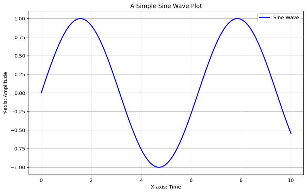
With your environment ready, you can begin by creating a simple yet informative plot. One of the most fundamental plots in data visualization is the line plot. By leveraging NumPy, you can generate a range of data points to visualize mathematical functions. The example below demonstrates how to create a basic sine wave plot. Here, np.linspace is used to create an array of evenly spaced numbers, while np.sin calculates the sine of these values. Matplotlib’s intuitive API then plots these data points, allowing you to easily add titles, labels, and legends to enhance readability.
import numpy as np
import matplotlib.pyplot as plt
# Generate 100 equally spaced values between 0 and 10
x = np.linspace(0, 10, 100)
# Compute the sine of these values
y = np.sin(x)
# Create a figure with a specified size
plt.figure(figsize=(10, 6))
# Plot the sine wave with a blue line and a descriptive label
plt.plot(x, y, label="Sine Wave", color="blue", linewidth=2)
# Add a title and axis labels
plt.title("A Simple Sine Wave Plot")
plt.xlabel("X-axis: Time")
plt.ylabel("Y-axis: Amplitude")
# Display the legend and grid
plt.legend()
plt.grid(True)
# Render the plot on screen
plt.show()
Output:

This code block generates a clear, concise line plot. The plt.figure function sets the dimensions of the plot, ensuring the visualization is easily interpretable. Customization through labels and gridlines makes the graph more informative and visually appealing, which is essential for effective data communication.
3. Advanced Customization and Styling
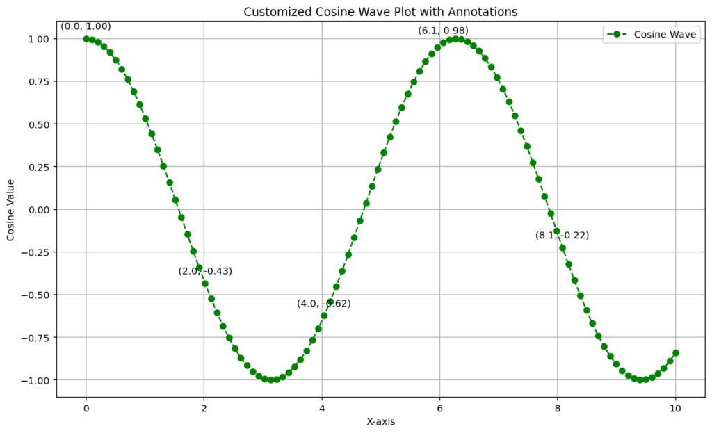
Matplotlib is renowned not only for its ease of use but also for its extensive customization options. Once you grasp the basics, you can elevate your plots by tweaking colors, line styles, markers, and annotations. The following example shows how to customize a cosine wave plot. In this example, markers and dashed lines are added for visual distinction, and annotations are strategically placed to emphasize key data points. Such customizations are invaluable when preparing plots for publication or presentations, as they allow you to tailor the visuals to your specific audience and objectives.
import numpy as np
import matplotlib.pyplot as plt
# Generate data for a cosine wave
x = np.linspace(0, 10, 100)
y = np.cos(x)
# Create a customized plot with markers and dashed lines
plt.figure(figsize=(12, 7))
plt.plot(x, y, marker="o", linestyle="--", color="green", label="Cosine Wave")
# Add annotations at regular intervals to highlight data values
for i in range(0, len(x), 20):
    plt.annotate(f"({x[i]:.1f}, {y[i]:.2f})", (x[i], y[i]), textcoords="offset points", xytext=(0,10), ha='center')
# Enhance the plot with titles and labels
plt.title("Customized Cosine Wave Plot with Annotations")
plt.xlabel("X-axis")
plt.ylabel("Cosine Value")
plt.legend()
plt.grid(True)
plt.show()
Output:

The above script enhances the basic cosine plot by incorporating visual markers and annotations. By using a loop to annotate key points, the plot not only becomes more informative but also visually engaging. Such detailed customizations help in conveying complex information clearly, ensuring that the audience can quickly grasp the insights being presented.
4. Integrating Matplotlib with NumPy and Statistical Analysis
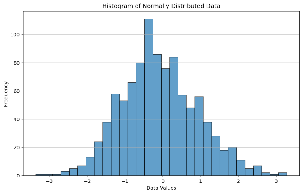
One of the greatest strengths of Matplotlib is its ability to work in harmony with NumPy and other data-centric libraries. This synergy allows for the seamless generation, manipulation, and visualization of data. For instance, you can generate a large dataset using NumPy’s random functions and then use Matplotlib to create a histogram that represents the distribution of the data. Histograms are essential for statistical analysis as they provide insights into the underlying frequency distribution, variance, and skewness of the data.
import numpy as np
import matplotlib.pyplot as plt
# Generate 1000 random data points from a normal distribution
data = np.random.normal(loc=0, scale=1, size=1000)
# Compute the histogram of the data with 30 bins
counts, bins = np.histogram(data, bins=30)
# Create a bar chart to represent the histogram
plt.figure(figsize=(10, 6))
plt.bar(bins[:-1], counts, width=np.diff(bins), edgecolor="black", alpha=0.7)
plt.title("Histogram of Normally Distributed Data")
plt.xlabel("Data Values")
plt.ylabel("Frequency")
plt.grid(axis="y")
plt.show()
Output:

This example leverages NumPy’s powerful data generation and manipulation functions to produce a histogram—a fundamental tool for data analysis. The visual representation of the frequency distribution allows you to quickly assess the behavior of the dataset, such as its central tendency and variability, making it an indispensable method in exploratory data analysis.
Summary
- Setup and Installation: Install Matplotlib via pip and import it to begin plotting.
- Creating Basic Plots: Use simple functions to create line plots and other basic visualizations.
- Advanced Customization: Enhance your plots with custom styles, markers, annotations, and gridlines.
- Integration with NumPy: Generate and analyze data with NumPy, and visualize the results effectively with Matplotlib.
This tutorial has provided a detailed introduction to Matplotlib, outlining everything from installation and basic plotting to advanced customization and integration with NumPy. Whether you are new to data visualization or looking to refine your plotting skills, mastering Matplotlib will empower you to create insightful, publication-quality graphics.
