Histograms are a fundamental tool in data analysis, allowing you to visualize the distribution of a dataset. In this tutorial, we cover several aspects of histogram creation.
Basic Histogram with Custom Bins
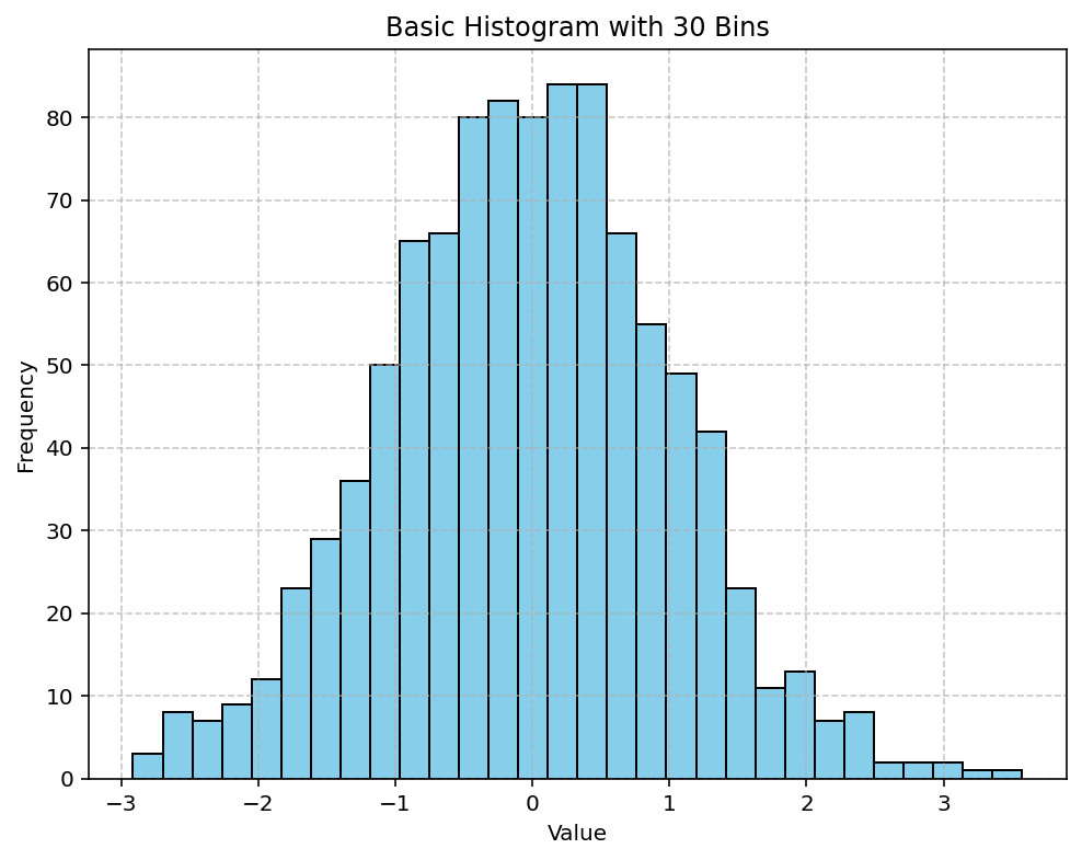
The following example generates 1000 random values drawn from a normal distribution. By setting the bins parameter (here, to 30), you adjust the granularity of your histogram. A higher bin count gives you a more detailed distribution, whereas a lower count smooths out the differences.
import matplotlib.pyplot as plt
import numpy as np

# Basic Histogram with Custom Bins
data = np.random.randn(1000)

plt.figure(figsize=(8, 6))
plt.hist(data, bins=30, color='skyblue', edgecolor='black')
plt.title('Basic Histogram with 30 Bins')
plt.xlabel('Value')
plt.ylabel('Frequency')
plt.grid(True, linestyle='--', alpha=0.7)
plt.show()
Output:

Cumulative and Normalized Histograms
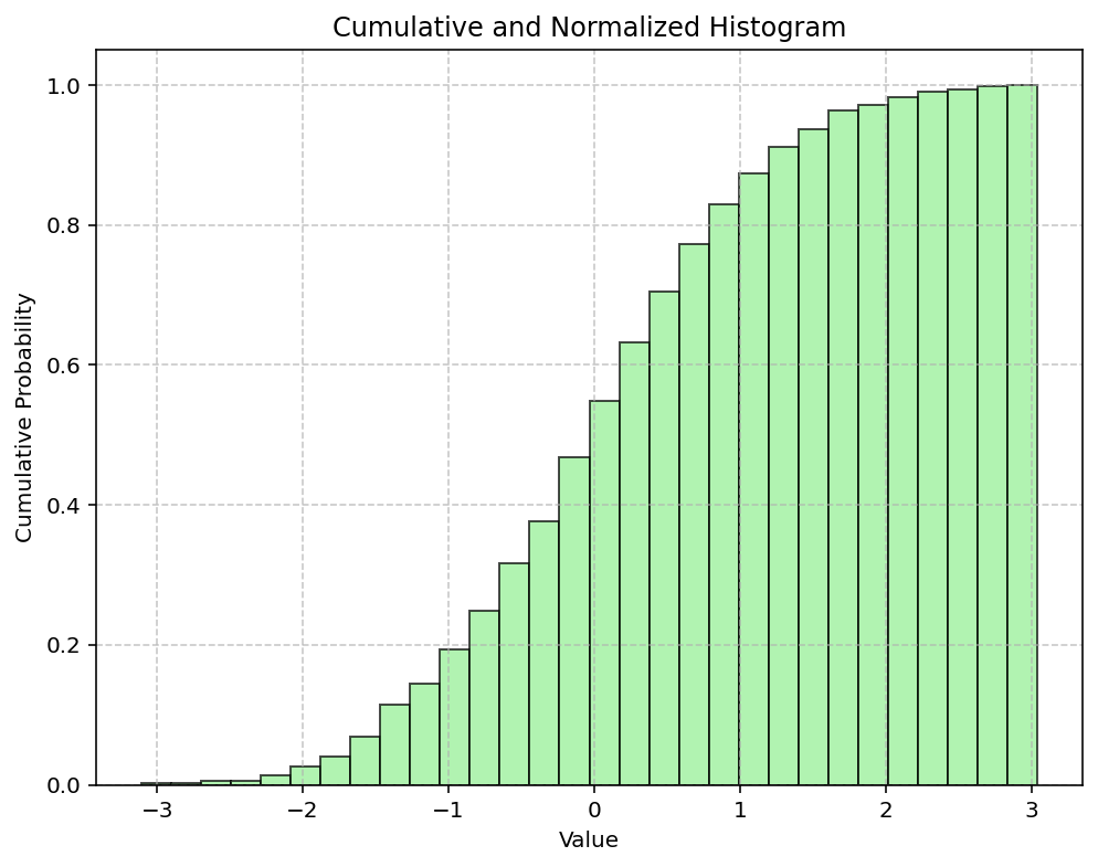
You can also visualize the cumulative distribution of your data by setting the cumulative parameter to True. Additionally, applying normalization (density=True) scales the histogram so the area under the histogram integrates to 1. This is particularly useful when comparing distributions with different sample sizes or when you require a probability density function (PDF) representation.
import matplotlib.pyplot as plt
import numpy as np

# Cumulative and Normalized Histogram
data = np.random.randn(1000)

plt.figure(figsize=(8, 6))
plt.hist(data, bins=30, cumulative=True, density=True, color='lightgreen', edgecolor='black', alpha=0.7)
plt.title('Cumulative and Normalized Histogram')
plt.xlabel('Value')
plt.ylabel('Cumulative Probability')
plt.grid(True, linestyle='--', alpha=0.7)
plt.show()
Output:

This comprehensive tutorial demonstrated how to create both basic and advanced histograms using Matplotlib. By adjusting the number of bins, enabling cumulative counts, and applying normalization, you can tailor your histogram to best represent your data’s distribution. Experiment with these settings to enhance your data analysis and visualization skills. Happy plotting!
