In this tutorial, we will learn how to create your first plot using Python’s Matplotlib library. You will discover how to use the basic plotting function plt.plot() to create a simple line plot from data and display it with plt.show(). We will also cover how to customize your visualization by adjusting line colors, styles, and markers. This guide is designed for beginners and explains each step with detailed examples.
1. Basic Plotting: Creating a Simple Line Plot
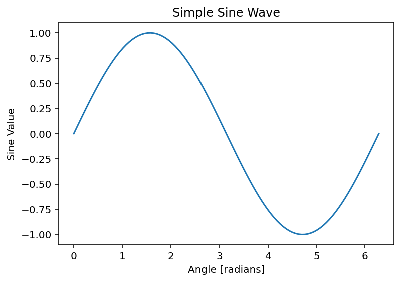
First, import the necessary libraries and generate a dataset. In the following example, NumPy is used to create 100 equally spaced points between 0 and 2π. We then compute the sine of these points and plot the resulting data.
Code Example:
import numpy as np
import matplotlib.pyplot as plt # Generate data: 100 points between 0 and 2π
x = np.linspace(0, 2 * np.pi, 100)
y = np.sin(x)
# Create a basic line plot
plt.plot(x, y)
plt.title('Simple Sine Wave')
plt.xlabel('Angle [radians]')
plt.ylabel('Sine Value')
plt.show()
Output:

The code starts by creating an array called x using np.linspace(0, 2 * np.pi, 100), which generates 100 evenly spaced numbers between 0 and 2π (approximately 6.2832). These values represent angles in radians along the x-axis, forming the foundation for plotting a sine wave over one full cycle. Next, y = np.sin(x) computes the sine of each value in the x array, producing a corresponding array y with 100 values that range between -1 and 1, capturing the oscillatory nature of the sine function. Then, plt.plot(x, y) takes these x and y arrays and creates a line plot, where each pair of (x[i], y[i]) points is connected by straight lines to visualize the smooth sine wave. After that, plt.title(‘Simple Sine Wave’) adds a title to the plot, giving it a clear label, while plt.xlabel(‘Angle [radians]’) and plt.ylabel(‘Sine Value’) label the x-axis and y-axis, respectively, to indicate what the axes represent—angles in radians and the sine function’s output. Finally, plt.show() displays the completed plot on the screen, rendering the sine wave with all its annotations for the user to see. Together, these steps produce a clean, labeled visualization of a sine wave spanning from 0 to 2π .
2. Customizing Your Plot: Colors, Styles, and Markers
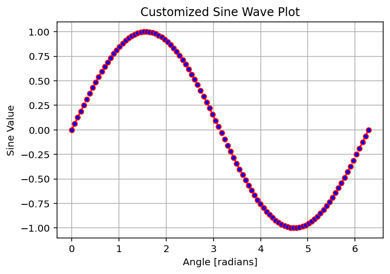
After mastering the basic plot, you can customize it to enhance its appearance. In the following example, we modify the plot by setting the line color to red, changing the linestyle to dashed, and adding circular markers with blue fill. A grid is also added for better readability.
Code Example:
import numpy as np
import matplotlib.pyplot as plt # Generate data: 100 points between 0 and 2π
x = np.linspace(0, 2 * np.pi, 100)
y = np.sin(x)
# Create a customized line plot
plt.plot(x, y, color='red', linestyle='--', marker='o', markerfacecolor='blue', markersize=5)
plt.title('Customized Sine Wave Plot')
plt.xlabel('Angle [radians]')
plt.ylabel('Sine Value')
plt.grid(True)
plt.show()
Output:

The code begins with x = np.linspace(0, 2 * np.pi, 100), which generates an array of 100 evenly spaced numbers between 0 and 2π (about 6.2832). These values represent angles in radians, setting up the x-axis for a full cycle of the sine function. Next, y = np.sin(x) calculates the sine of each value in the x array, producing a corresponding array y with 100 values that oscillate between -1 and 1, capturing the classic sine wave shape. Now, the plotting magic happens with plt.plot(x, y, color=’red’, linestyle=’–‘, marker=’o’, markerfacecolor=’blue’, markersize=5). This line creates the line plot, but it’s packed with customization:
- x and y are the data points being plotted, just like before.
- color=’red’ makes the line itself red.
- linestyle=’–‘ sets the line to a dashed pattern (instead of the default solid line).
- marker=’o’ adds a circular marker at each of the 100 data points.
- markerfacecolor=’blue’ fills those circular markers with blue (while the marker edges stay red, matching the line).
- markersize=5 sets the size of the markers to 5 units, making them small but noticeable. This creates a visually striking plot: a red dashed line connecting blue-filled circles at each point along the sine wave.
After setting up the plot, plt.title(‘Customized Sine Wave Plot’) adds a title, clearly labeling it as a customized version of the sine wave. Then, plt.xlabel(‘Angle [radians]’) labels the x-axis to show that the values represent angles in radians, and plt.ylabel(‘Sine Value’) labels the y-axis to indicate the sine function’s output, making the plot easy to interpret. The line plt.grid(True) adds a grid to the background, with horizontal and vertical lines that align with the axis ticks, helping you visually track the data points more precisely.
Finally, plt.show() displays the finished plot on the screen. The result is a vibrant, customized sine wave: a red dashed line with blue dots tracing the familiar oscillation from 0 to
2π, overlaid on a grid, with clear labels and a title. It’s a step up from a basic plot, blending style and clarity to make the visualization pop!
Summary
- Basic Plotting: Learn to use
plt.plot()andplt.show()to quickly visualize data. - Customization: Enhance your plot by adjusting attributes like color, linestyle, and markers.
- Additional Features: Adding titles, labels, and grid lines makes your visualization more informative.
