This tutorial demonstrates the fundamentals of creating pie charts using Matplotlib, along with customizing slices using labels and an explode effect. Below, you’ll find two examples: one showing a basic pie chart, and another with customized slice properties.
Basic Pie Chart
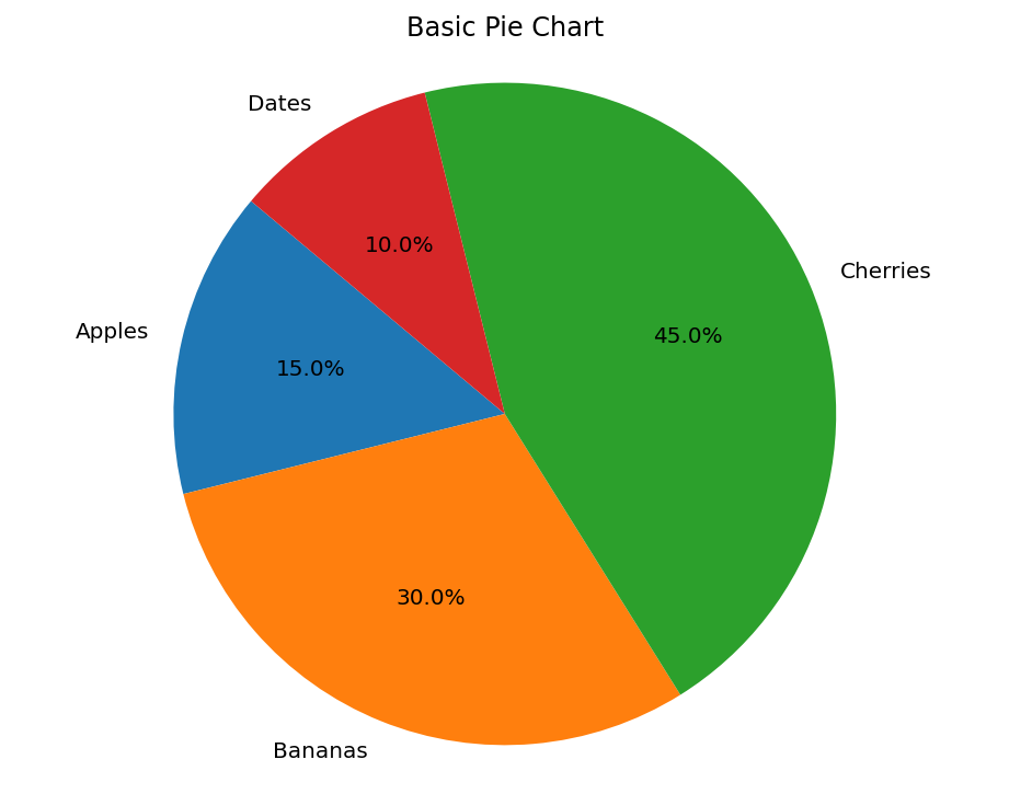
The following code creates a basic pie chart. In this example, sample data is defined with labels and corresponding sizes, and the autopct parameter displays the percentage for each slice. The startangle parameter rotates the chart for better presentation. The axis is set to equal to ensure the chart is circular.
import matplotlib.pyplot as plt

# Data for the pie chart
labels = ['Apples', 'Bananas', 'Cherries', 'Dates']
sizes = [15, 30, 45, 10]

plt.figure(figsize=(8, 6))
plt.pie(sizes, labels=labels, autopct='%1.1f%%', startangle=140)
plt.title('Basic Pie Chart')
plt.axis('equal')  # Equal aspect ratio ensures the pie chart is circular.
plt.show()
Output:

Customized Pie Chart with Explode Effect
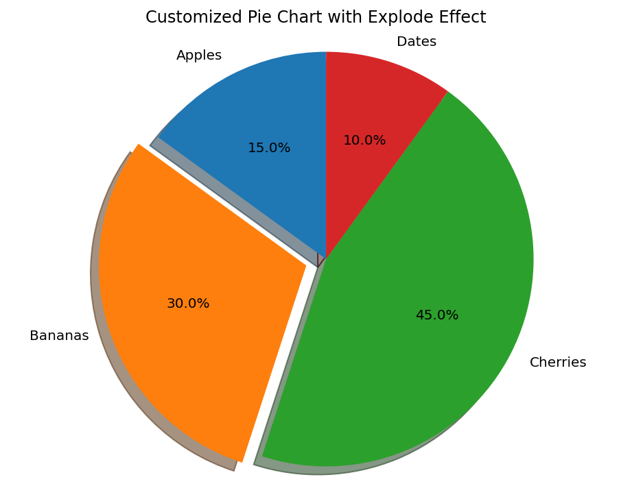
In this example, we customize the pie chart by “exploding” one of the slices, adding a shadow, and fine-tuning the labels and percentages. The explode tuple defines which slice to offset from the chart. Here, only the second slice (Bananas) is exploded.
import matplotlib.pyplot as plt

# Data for the pie chart
labels = ['Apples', 'Bananas', 'Cherries', 'Dates']
sizes = [15, 30, 45, 10]
explode = (0, 0.1, 0, 0)  # Explode only the second slice (Bananas)

plt.figure(figsize=(8, 6))
plt.pie(sizes, explode=explode, labels=labels, autopct='%1.1f%%', shadow=True, startangle=90)
plt.title('Customized Pie Chart with Explode Effect')
plt.axis('equal')  # Equal aspect ratio ensures the pie chart is circular.
plt.show()
Output:

By adjusting these properties, you can easily customize your pie charts to highlight important data points and improve overall readability. Experiment with different parameters such as colors, explode, and startangle to achieve the desired look for your chart.
