Bar plots are one of the most widely used visualization techniques in data science and analytics. They provide a simple way to represent numerical values across different categories. In this tutorial, we will explore how to create basic vertical and horizontal bar plots, and then move on to comparing multiple datasets with grouped and stacked bar plots. With this guide, you will learn how to effectively customize your plots using colors, labels, gridlines, and other styling elements available in Matplotlib.
1. Vertical and Horizontal Bar Plots
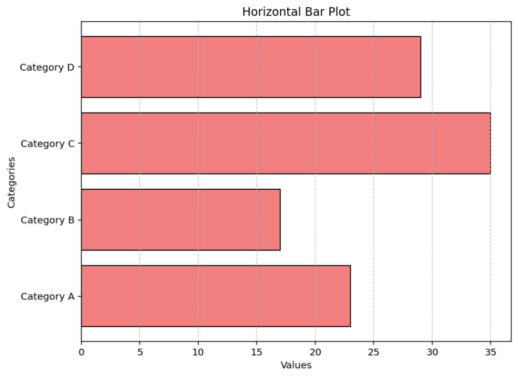
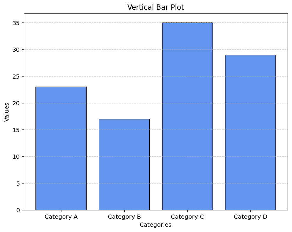
The first part of the tutorial demonstrates how to build vertical and horizontal bar plots. We start by defining a list of categories along with corresponding numeric values. Then, using Matplotlib’s plt.bar() for vertical plots and plt.barh() for horizontal plots, we generate two visual representations of the data. Notice how gridlines, colors, and labels are added for clarity.
import matplotlib.pyplot as plt

# Data for the bar plots
categories = ['Category A', 'Category B', 'Category C', 'Category D']
values = [23, 17, 35, 29]

# Vertical Bar Plot
plt.figure(figsize=(8, 6))
plt.bar(categories, values, color='cornflowerblue', edgecolor='black')
plt.title('Vertical Bar Plot')
plt.xlabel('Categories')
plt.ylabel('Values')
plt.grid(axis='y', linestyle='--', alpha=0.7)
plt.show()

# Horizontal Bar Plot
plt.figure(figsize=(8, 6))
plt.barh(categories, values, color='lightcoral', edgecolor='black')
plt.title('Horizontal Bar Plot')
plt.xlabel('Values')
plt.ylabel('Categories')
plt.grid(axis='x', linestyle='--', alpha=0.7)
plt.show()
Output:


The code above demonstrates two fundamental approaches: a vertical bar plot where the categories are set along the x-axis and a horizontal bar plot where the categories align along the y-axis. Adjusting the figsize, colors, edge styling, and gridlines helps improve the visualization’s overall clarity.
2. Grouped and Stacked Bar Plots
When visualizing multiple datasets for the same set of categories, it is useful to employ grouped or stacked bar plots. Grouped bar plots display the datasets side-by-side for each category, making comparisons straightforward. Stacked bar plots, on the other hand, layer the datasets on top of each other to display cumulative totals. The examples below explain both techniques in detail.
Grouped Bar Plot
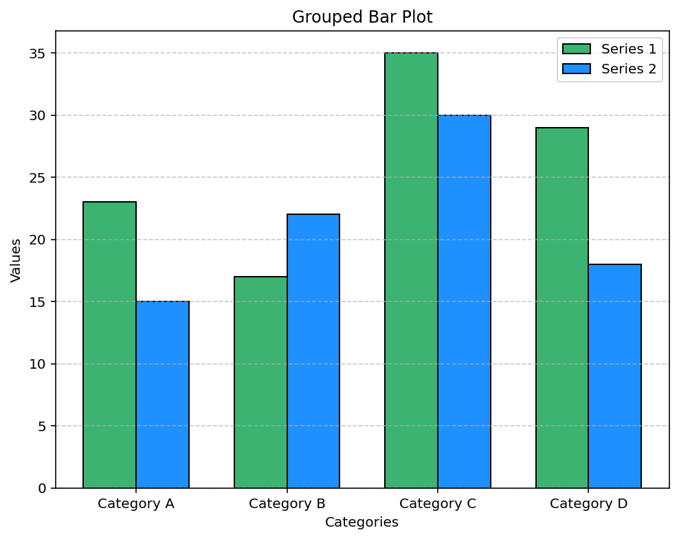
In a grouped bar plot, each category is divided into segments representing different data series. To achieve this, we generate a set of positions along the x-axis using NumPy and offset the bars for each series by a fixed width. This arrangement allows for a side-by-side comparison.
import matplotlib.pyplot as plt
import numpy as np

# Define categories and two sets of values for each category
categories = ['Category A', 'Category B', 'Category C', 'Category D']
series1 = [23, 17, 35, 29]
series2 = [15, 22, 30, 18]

# Create positions for the grouped bars
x = np.arange(len(categories))
width = 0.35  # Width of each bar

plt.figure(figsize=(8, 6))
plt.bar(x - width/2, series1, width, label='Series 1', color='mediumseagreen', edgecolor='black')
plt.bar(x + width/2, series2, width, label='Series 2', color='dodgerblue', edgecolor='black')

# Setting x-ticks and labels
plt.xticks(x, categories)
plt.xlabel('Categories')
plt.ylabel('Values')
plt.title('Grouped Bar Plot')
plt.legend()
plt.grid(axis='y', linestyle='--', alpha=0.7)
plt.show()
Output:

This example creates a grouped bar plot by positioning two data series side-by-side. The np.arange() function sets the x-axis coordinates for the categories, and the width variable is used to offset the bars for each series appropriately. Adding legends and gridlines further enhances interpretability.
Stacked Bar Plot
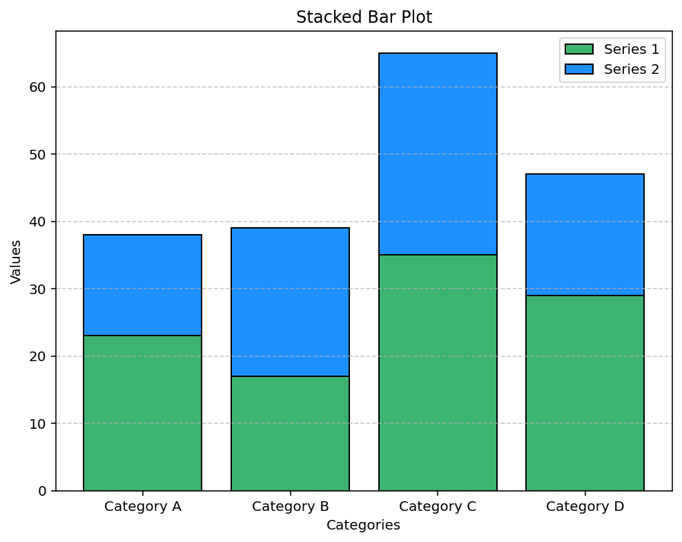
The stacked bar plot displays the data series cumulatively, making it easier to see the total value for each category while also comparing individual series contributions. By using the bottom parameter in plt.bar(), we specify where the second series should start, effectively stacking it on top of the first.
import matplotlib.pyplot as plt

# Reuse the same data for categories and series values
categories = ['Category A', 'Category B', 'Category C', 'Category D']
series1 = [23, 17, 35, 29]
series2 = [15, 22, 30, 18]

plt.figure(figsize=(8, 6))
plt.bar(categories, series1, label='Series 1', color='mediumseagreen', edgecolor='black')
plt.bar(categories, series2, bottom=series1, label='Series 2', color='dodgerblue', edgecolor='black')

plt.xlabel('Categories')
plt.ylabel('Values')
plt.title('Stacked Bar Plot')
plt.legend()
plt.grid(axis='y', linestyle='--', alpha=0.7)
plt.show()
Output:

The stacked bar plot code above layers the second series on top of the first by setting the bottom argument equal to the first series’ values. This visualization is particularly useful when you need to see the combined effect of multiple data series along with their individual contributions.
