Matplotlib is a powerful and widely-used Python library for creating high-quality visualizations, making it an essential tool for data analysis and scientific computing. Among its many capabilities, Matplotlib excels at generating line plots, which are fundamental for displaying trends, relationships, and changes in data over a continuous range. With its intuitive interface and extensive customization options, Matplotlib allows users to craft clear and informative line plots tailored to their specific needs. Whether you’re plotting time series data, comparing multiple datasets, or exploring mathematical functions, Matplotlib’s flexibility and robust feature set make it an ideal choice for both beginners and advanced users alike. This introduction will guide you through the basics of creating line plots with Matplotlib, unlocking the potential to visualize data effectively.
Basic Line Plot
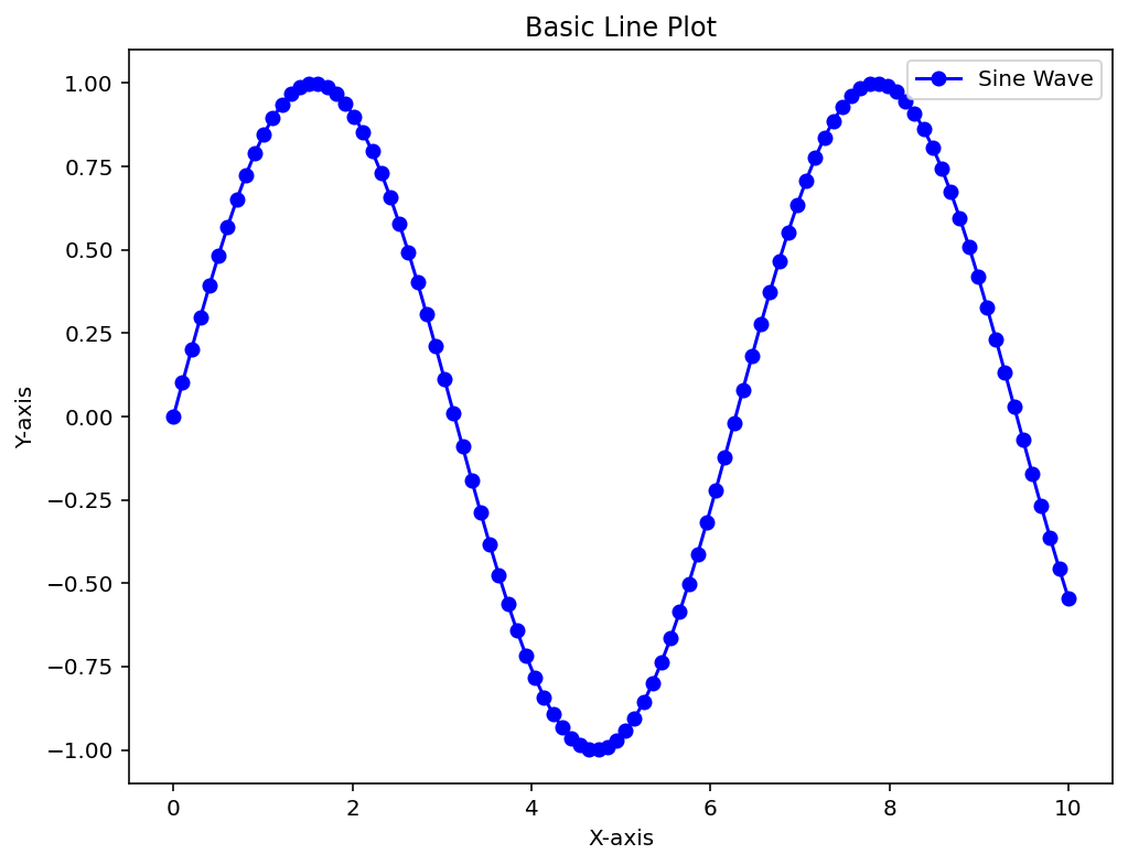
By leveraging Matplotlib’s pyplot module alongside NumPy for data generation, this example demonstrates the foundational steps of plotting: generating data, customizing the figure, and adding descriptive elements. The following code snippet will walk you through creating a basic sine wave plot, showcasing Matplotlib’s ability to blend simplicity with detailed control over plot aesthetics. Let’s see how it comes together.
import matplotlib.pyplot as plt
import numpy as np

# Generate sample data for the sine wave
x = np.linspace(0, 10, 100)
y = np.sin(x)

# Create a figure with a specified size
plt.figure(figsize=(8, 6))

# Plot the sine wave with custom styling
plt.plot(x, y, label='Sine Wave', color='blue', linestyle='-', marker='o')

# Add title and axis labels
plt.title('Basic Line Plot')
plt.xlabel('X-axis')
plt.ylabel('Y-axis')

# Add a legend to identify the plot
plt.legend()

# Display the plot
plt.show()
Output:

This code creates a simple sine wave plot using Python’s Matplotlib and NumPy libraries. It starts by importing matplotlib.pyplot as plt for plotting and numpy as np for numerical tasks, then generates 100 evenly spaced x-values from 0 to 10 with np.linspace. The corresponding y-values are calculated as the sine of those x-values using np.sin. A figure is set up with a size of 8×6 inches via plt.figure, and the sine wave is plotted with plt.plot, styled as a blue solid line with circular markers, labeled “Sine Wave” for the legend. The plot gets a title, “Basic Line Plot,” and labeled axes—“X-axis” and “Y-axis”—with plt.title, plt.xlabel, and plt.ylabel, respectively. Finally, plt.legend adds a legend to identify the curve, and plt.show displays the finished graph, showing a smooth, marked sine wave across the specified range.
Multiple Lines and Customization
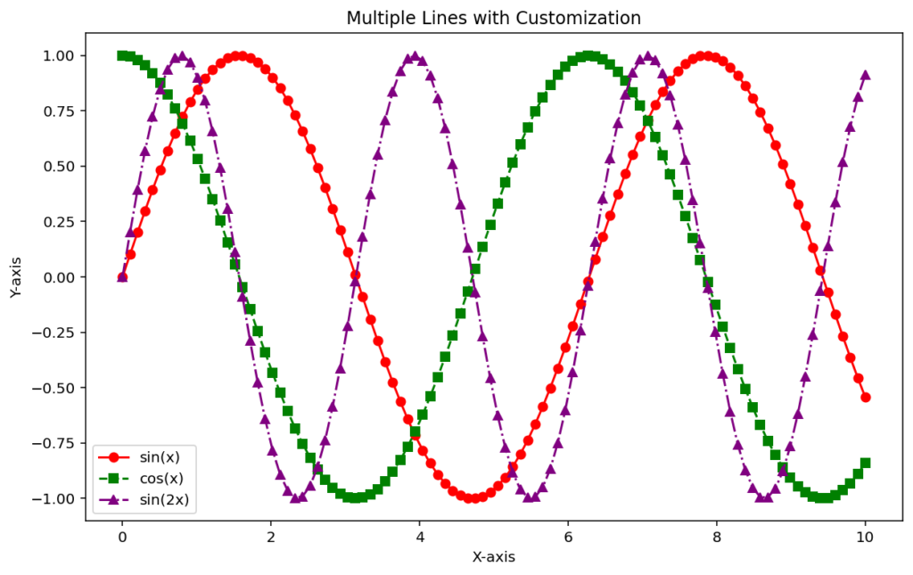
This Python script uses Matplotlib and NumPy to plot three distinct mathematical functions—sine, cosine, and a double-frequency sine—on a single graph with customized styles:
import matplotlib.pyplot as plt
import numpy as np

# Generate sample data
x = np.linspace(0, 10, 100)
y1 = np.sin(x)
y2 = np.cos(x)
y3 = np.sin(2 * x)

# Create a figure with a specified size
plt.figure(figsize=(10, 6))

# Plot multiple lines with custom colors, linestyles, and markers
plt.plot(x, y1, label='sin(x)', color='red', linestyle='-', marker='o')
plt.plot(x, y2, label='cos(x)', color='green', linestyle='--', marker='s')
plt.plot(x, y3, label='sin(2x)', color='purple', linestyle='-.', marker='^')

# Add title and axis labels
plt.title('Multiple Lines with Customization')
plt.xlabel('X-axis')
plt.ylabel('Y-axis')

# Add a legend to identify each line
plt.legend()

# Display the plot
plt.show()
Output:

This Python code uses the Matplotlib library to create a line plot visualizing a sine wave, offering a simple yet elegant approach. First, the matplotlib.pyplot and numpy libraries are imported—one for plotting and the other for efficiently generating data. Next, an x-axis is created with 100 evenly spaced points from 0 to 10, and the corresponding y-axis is computed as the sine of those points. The plot’s canvas is set up with an 8×6-inch figure, and the sine wave is drawn in blue with a solid line and circular markers at each point, labeled as “Sine Wave.” The graph is given a title, “Basic Line Plot,” along with straightforward x- and y-axis labels, and a legend is added to clarify what the line represents. Finally, plt.show() displays the result, producing a clean, clear, and visually appealing sine wave plot.
This foundational knowledge of creating and customizing line plots will help you build clear and informative visualizations tailored to your dataset’s needs.
