Understanding the anatomy of a Matplotlib plot is essential for creating clear and informative visualizations. In Matplotlib, every plot is built upon two core components: the Figure and the Axes. The Figure serves as the overall canvas or container for your plot, while the Axes represent the individual plotting areas within the Figure where the actual data is drawn. By mastering these components, you can design multi-panel figures and customize each subplot as needed.
This section demonstrates how to create a Figure and Axes, plot two datasets (sine and cosine functions), and add informative labels, a title, and a legend.
Code Example:
import matplotlib.pyplot as plt
import numpy as np
# Generate sample data
x = np.linspace(0, 10, 100)
y1 = np.sin(x)
y2 = np.cos(x)
# Create a Figure and a single Axes object with a specified size
fig, ax = plt.subplots(figsize=(8, 6))
# Plot the sine and cosine functions on the Axes
ax.plot(x, y1, label='Sine', color='blue', linestyle='-', marker='o')
ax.plot(x, y2, label='Cosine', color='green', linestyle='--', marker='s')
# Add a title and axis labels using Axes methods
ax.set_title('Understanding Plot Anatomy: Figure and Axes')
ax.set_xlabel('X-axis (radians)')
ax.set_ylabel('Function Value')
# Add a legend to identify the plotted lines
ax.legend()
# Display the plot
plt.show()
Code Breakdown
1. Importing Libraries
import matplotlib.pyplot as plt
import numpy as np- matplotlib.pyplot as plt: This imports Matplotlib’s pyplot module, a collection of functions that simplify plotting, and aliases it as plt for convenience. It’s the standard way to access Matplotlib’s plotting tools.
- numpy as np: This imports NumPy, a library for numerical operations, aliased as np. It’s used here to generate data efficiently.
2. Generating Sample Data
x = np.linspace(0, 10, 100)
y1 = np.sin(x)
y2 = np.cos(x)- x = np.linspace(0, 10, 100): Creates an array of 100 evenly spaced values from 0 to 10 (inclusive). These will be the x-axis points, representing radians in this case.
- y1 = np.sin(x): Computes the sine of each value in x, producing an array of 100 corresponding y-values for the sine function.
- y2 = np.cos(x): Computes the cosine of each value in x, generating another array of 100 y-values for the cosine function. Together, x, y1, and y2 form the data to be plotted.
3. Creating a Figure and Axes
fig, ax = plt.subplots(figsize=(8, 6))- plt.subplots(): This function creates a Figure (the overall canvas) and one or more Axes objects (the plotting areas within the figure). Here, it creates a single Axes object since no grid dimensions are specified (e.g., nrows=2 would create multiple subplots).
- figsize=(8, 6): Sets the figure’s size to 8 inches wide and 6 inches tall, controlling the plot’s dimensions in the output.
- fig, ax =: Unpacks the returned tuple into fig (the Figure object) and ax (the Axes object). While fig isn’t used further here, ax is used to build the plot, showcasing the object-oriented approach to Matplotlib.
4. Plotting the Sine and Cosine Functions
ax.plot(x, y1, label='Sine', color='blue', linestyle='-', marker='o')
ax.plot(x, y2, label='Cosine', color='green', linestyle='--', marker='s')- ax.plot(): This method plots data on the Axes object. It’s called twice—once for the sine function (x, y1) and once for the cosine function (x, y2).
- Arguments for Sine Plot:
- x, y1: The x- and y-coordinates to plot (sine values).
- label=’Sine’: Assigns a label for the legend to identify this line.
- color=’blue’: Sets the line color to blue.
- linestyle=’-‘: Uses a solid line (default style).
- marker=’o’: Adds circular markers at each data point.
- Arguments for Cosine Plot:
- x, y2: The x- and y-coordinates (cosine values).
- label=’Cosine’: Legend label for this line.
- color=’green’: Sets the line color to green.
- linestyle=’–‘: Uses a dashed line for distinction.
- marker=’s’: Adds square markers at each point.
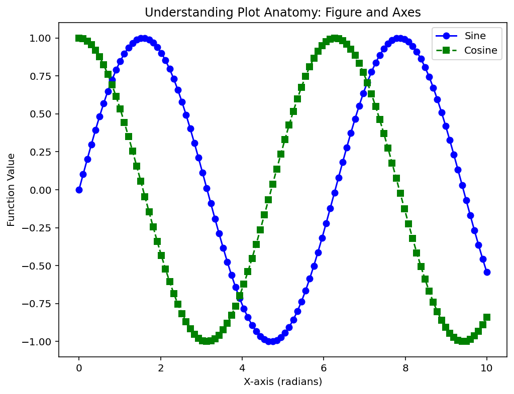
- Result: Two lines are plotted on the same Axes: a blue solid line with circles for sine and a green dashed line with squares for cosine.
5. Adding Titles and Labels
ax.set_title('Understanding Plot Anatomy: Figure and Axes')
ax.set_xlabel('X-axis (radians)')
ax.set_ylabel('Function Value')- ax.set_title(): Adds a title above the plot, explaining its purpose—here, to illustrate Matplotlib’s Figure and Axes concepts.
- ax.set_xlabel(): Labels the x-axis as “X-axis (radians),” indicating the units of x.
- ax.set_ylabel(): Labels the y-axis as “Function Value,” describing what y1 and y2 represent (sine and cosine amplitudes).
- These methods enhance readability, making the plot’s context clear to viewers.
6. Adding a Legend
ax.legend()- ax.legend(): Displays a legend based on the label arguments from ax.plot(). It places a box (default position: upper-right) identifying “Sine” (blue solid line) and “Cosine” (green dashed line), helping distinguish the plotted functions.
7. Displaying the Plot
plt.show()- plt.show(): Renders the plot to the screen. Until this is called, the plot exists in memory but isn’t visible. It’s the final step to display the Figure and Axes as constructed.
What the Code Does Overall
This code generates a single plot showing the sine and cosine functions over the interval [0, 10] radians, with 100 points for smooth curves. The plot is customized with:
- A blue solid line with circular markers for sin(x).
- A green dashed line with square markers for cos(x).
- A title, axis labels, and a legend for clarity.
- A figure size of 8×6 inches for a balanced layout.
Output:

This code creates a plot where:
- The
plt.subplots()function returns a Figure (fig) and an Axes (ax), establishing the basic structure of the plot. - Two datasets, the sine and cosine functions, are plotted on the same Axes with distinct styles.
- The
set_title(),set_xlabel(), andset_ylabel()methods add a descriptive title and labels to the axes. - The
ax.legend()method automatically generates a legend that distinguishes between the sine and cosine plots.
This foundational knowledge of plot anatomy enables you to build and customize more complex visualizations in Matplotlib.
